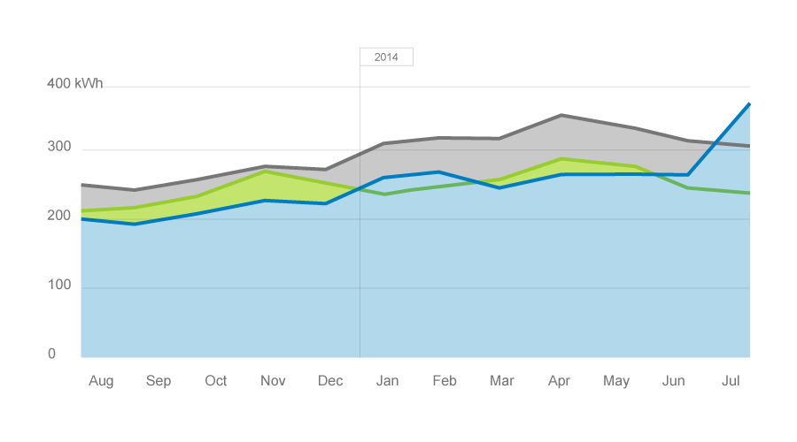
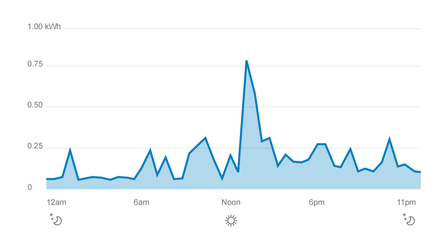
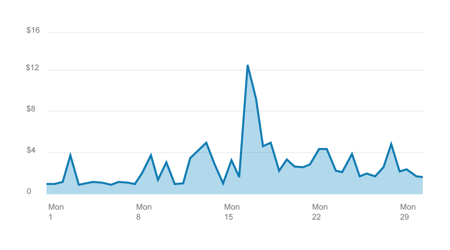
These are similar to line charts, but with a color fill. On the web, we use this style to emphasize how much energy a person used.
The color fill adds visual interest to the page. By emphasizing the distance between the zero baseline and the line itself, area charts reinforce the idea that this is a discrete amount you used.
![]() If you’re not sure whether to use an area chart, don’t use one.
If you’re not sure whether to use an area chart, don’t use one.
![]() In general, don’t use area charts in print layouts. It increases printing costs and can be less accessible to visually impaired people.
In general, don’t use area charts in print layouts. It increases printing costs and can be less accessible to visually impaired people.
Wondering if you’re using the right type of chart? See the side-by-side comparison.