Pie charts show part-to-whole relationships. They’re best for showing coarse relative size across categories.
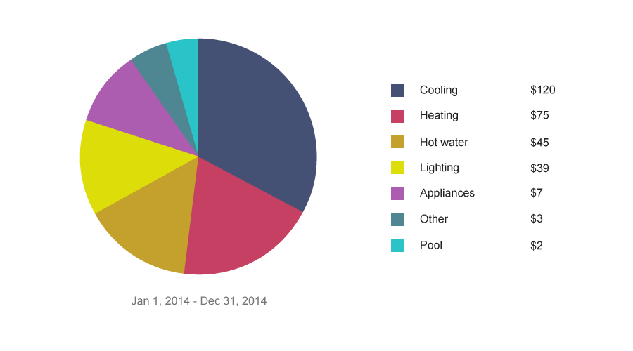
![]() Show 7 slices max, biggest one first.
Show 7 slices max, biggest one first.
![]() Align the main piece so it starts at 12 o’clock.
Align the main piece so it starts at 12 o’clock.
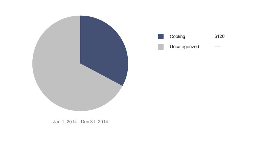
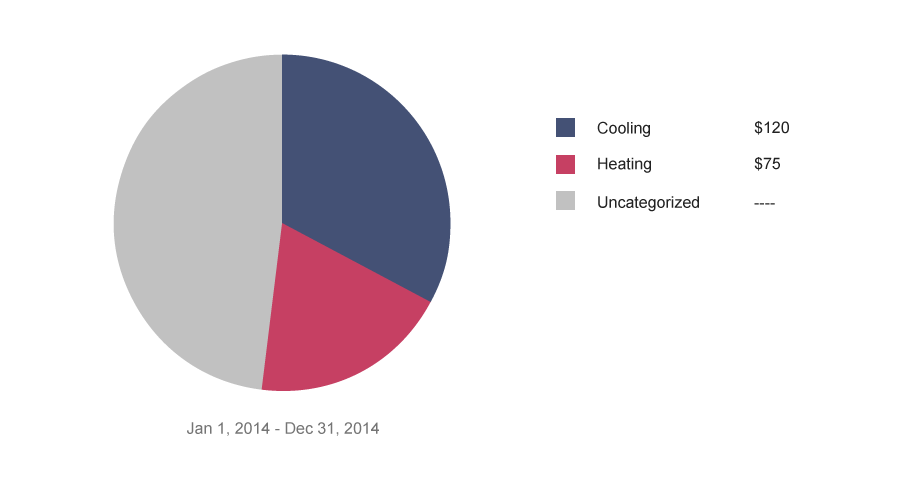
![]() Make sure it adds up to 100%! If there’s data missing, show it as “uncategorized” or “other.”
Make sure it adds up to 100%! If there’s data missing, show it as “uncategorized” or “other.”
![]() Pair data with interpretation.
Pair data with interpretation.
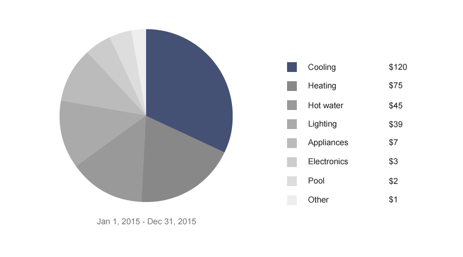
![]() Don’t show multiple pies.
Don’t show multiple pies.
![]() Use a pie, not donut-style chart.
Use a pie, not donut-style chart.
Wondering if you’re using the right type of chart? See the side-by-side comparison.