Line charts show trends—the lines represent a continuous data series. This is the best way to illustrate volatility and sudden peaks and valleys.
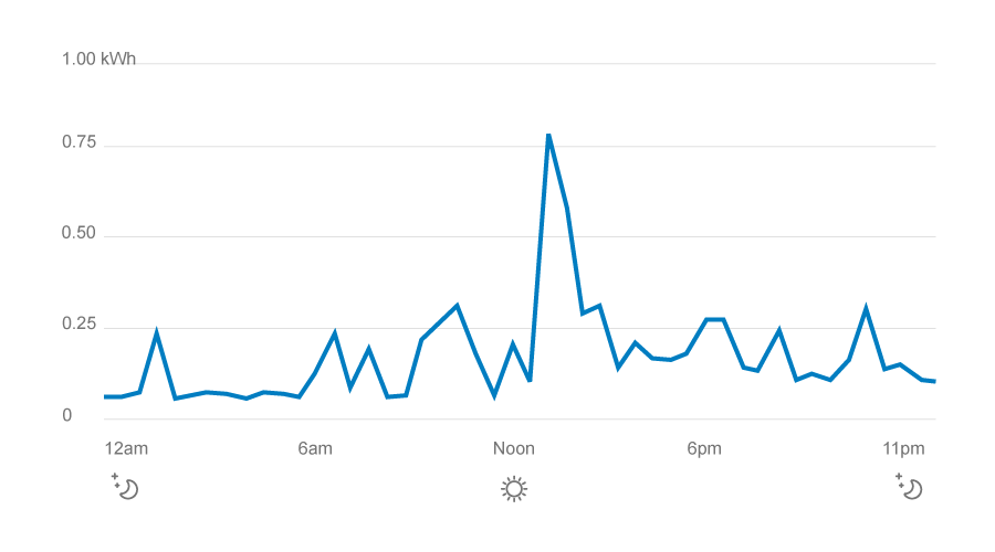
![]() Show an appropriate period of time (at least 5 items). Otherwise, it will look like a squiggle.
Show an appropriate period of time (at least 5 items). Otherwise, it will look like a squiggle.
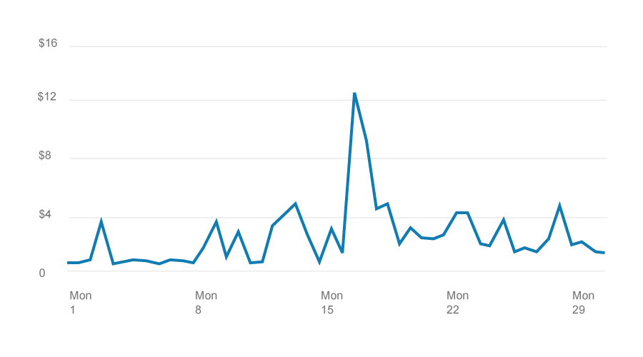
![]() Use light horizontal grid lines to help guide the user’s eye across the chart.
Use light horizontal grid lines to help guide the user’s eye across the chart.
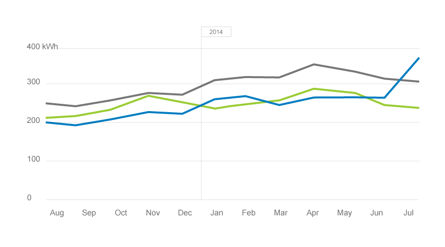
![]() Don’t include more than 4 lines on one chart.
Don’t include more than 4 lines on one chart.
Wondering if you’re using the right type of chart? See the side-by-side comparison.