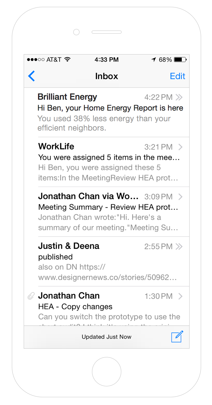
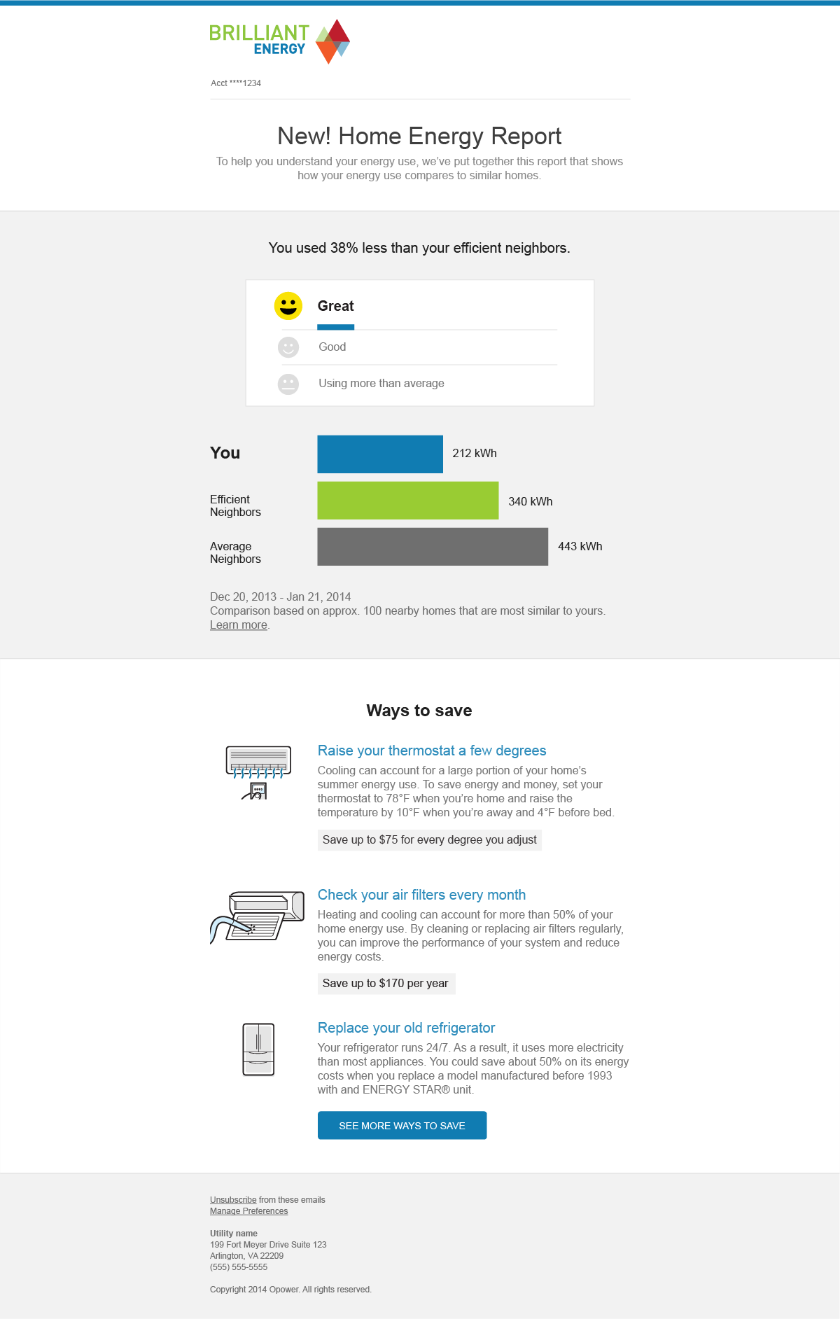
The average email inbox is crowded, with a multitude of different voices competing for a reader’s attention. In order to get timely and important energy information in front of them, we design emails with the following principles in mind:
- Clear hierarchy to guide the reader to one primary message
- Consistent header and footer with utility brand, and space for custom messages and marketing
- Responsive design that works for web and mobile
Email elements

- Subject Line
- Gives the person a reason to open the email.
- Preheader
- Previews the primary message (usually the headline or insight).

- Header
- Includes brand elements to show the email is from the utility.
- Introduction
- An introduction to the email, like a welcome message.
- Insight
- Provides an interpretation to help people understand the data.
- Body
- Shows insights, graphs, tips, and other information users should read about. As in the web layout, emails use [alternating colors](space.html) to break up the content into sections. Data should go on light gray and insights on white.
- Call to action
- This is the primary action—don’t include more than one.
- Footer
- Includes utility information and ways for people to unsubscribe.
Email typography
Primary message
32px .display-small
Only use at the top of the page (top module). Using in the middle mucks up the hierarchy.
In general, write as a full sentence.
Don’t use for page or section headings (use hierarchical type instead).
Section heading 1
20px .heading-section
Keep it short—3-5 words.
Use sentence case.
Don’t use punctuation. Exception: OK to use a question mark if needed
Section heading 2
16px bold .heading-section-subheading
Keep it short—3-5 words.
Use sentence case.
Use keywords that help describe the content below. Ex: Ways to save
Body, captions
16px .paragraph
Don’t use too much bold, and avoid using all caps for emphasis.
Graph Label
16px .graph-label
Use title case. Ex: Efficient Neighbors.
Footer text
12px .aside
Include the utility’s contact information.
Links should only have an underline.
Email grid reference
Our email grid is based off of Ink. It’s responsive, nestable, and 12 columns wide—similar to the Web layout grid—but it’s built in HTML tables.
- Containers wrap the content and maintain a fixed, 580px layout on large displays. Below 580px, containers take up 90% of the interface’s width so the content doesn’t run right up against the edges of the screen.
- Rows separate blocks of content vertically and create our alternating backgrounds. They can be either the parent or a child of a container.
- Columns denote the width of the content based on a 12-column system, so the number of columns in a row should add up to 12. Columns stack vertically in a single column layout for small screens (under 580px wide).
We’ve extracted Ink‘s grid into Sass mixins, so use them to create the grid:
| Mixin | Element | Description |
|---|---|---|
container | table | Constrains the content to a 580px wrapper on large screens (90% on small screens) and centers it within the body. |
row | table | Separates content vertically |
row-alt | table | Separates content vertically, with alternate background color |
wrapper(last) | td | Wraps each columns(n) table, in order to create a gutter between columns and force them to expand to full width on small screens. The last wrapper of a 12 column table needs to be of wrapper(last), while all other column tables should just be wrapper. |
offset-by(n) | td | How many columns to offset the column table by (left margin). Can be any number between 1 to 11. |
pull-by(n) | td | How many columns to pull the column table by (right margin). Can be any number between 1 to 11. |
columns(n) | table | Used to determine how many columns this table takes up, and can be any number between 1 and 12. The number of columns should add up to 12, including any offsets or pulls. |
text-pad(left/right/both) | table | Adds extra padding (10px) to the left, right, or both sides of a column table. |
column-content | td | Apply to td within each column table. Expands to width of screen for mobile devices. |
expander | td | An empty (and invisible) element added after the content element in a the column table. It forces the content within column-content to expand to the full width of the screen on small devices, instead of just the width of the content within the element. |
Need a starting point for a new email design? Opattern has you covered. Check out the Opattern emails repository for example HTML and Sass, or expand the example below.
// SCSS

.container {
  @include container;
}

.row {
  @include row;
}

.row-alt {
  @include row-alt;
}

.wrapper-last {
  @include wrapper(last);
}

.wrapper {
  @include wrapper();
}

.twelve-columns {
  @include column(12);
}

.six-columns {
  @include column(6);
}

.column-content {
  @include column-content;
}

.expander {
  @include expander;
}
12 Columns
6 Columns
6 Columns